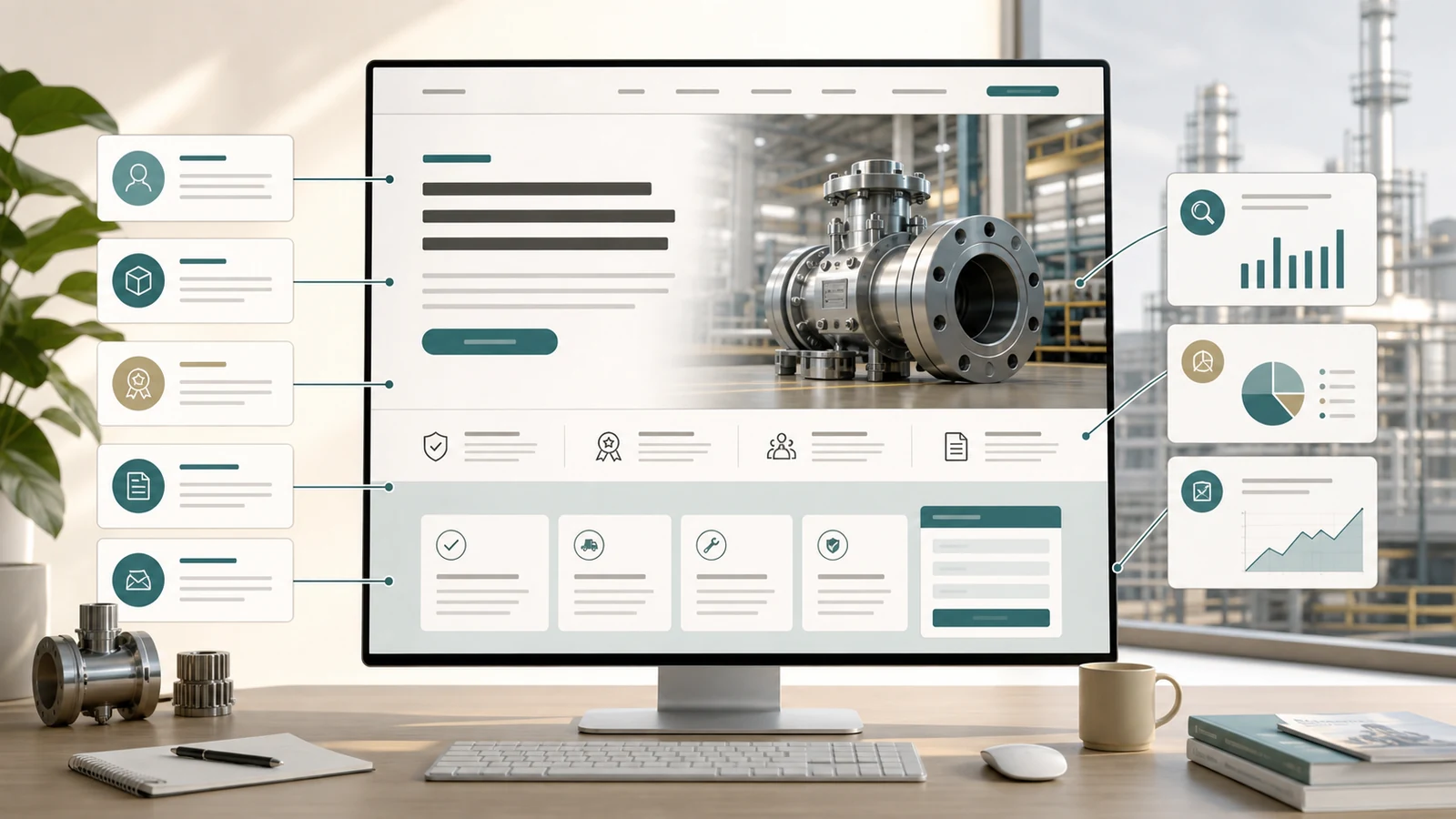
The first screen has one core job
The first screen of an industrial landing page is not a company profile or a full product manual. Its most important job is to help a buyer decide within a few seconds whether the page matches the product or solution they are looking for.
If the first screen starts with generic claims such as professional, leading or one-stop service, buyers still do not know whether the product fits their material, process, capacity, certification or delivery requirement. For paid traffic and search traffic, that uncertainty increases the risk of leaving the page.
Write the headline around product and use case
The headline should make the product category, target buyer or application scenario clear. Industrial buyers are usually not visiting the page to read beautiful wording. They need to confirm whether the offer fits their process, material, capacity, compliance or delivery situation.
The headline does not need to force every keyword into one line, but it should avoid vague language. A specific product and application statement is usually stronger than a slogan. The exact wording should always come from verified product facts.
- Does the headline name the product or service category?
- Does it show the industry, material or application scenario?
- Does it avoid unverifiable claims such as leading, first or guaranteed?
- Can a first-time visitor understand the page direction quickly?
Use the subheadline to clarify conditions
The headline tells buyers what the page is about. The subheadline should add the conditions for judgment. For industrial landing pages, it can explain suitable scope, support method, parameters needed from the buyer, or what this type of solution cannot solve.
This is often more useful than repeating advantages. When buyers understand the boundary early, later inquiries are more likely to become specific discussions instead of vague messages.
Keep proof focused and verifiable
The first screen can include a small amount of trust evidence, such as product visuals, process footage, inspection workflow, certification categories, delivery steps or a technical document entry. It should not be filled with client logos, unverifiable numbers or exaggerated promises.
If a client name, project outcome or ranking is not publicly authorized and verifiable, it should not be placed in the first screen. For manufacturers and export companies, clear and verifiable information is better for long-term SEO and AI search understanding than inflated claims.
Make the call to action specific
The first-screen button does not have to say only submit. A clearer call to action tells the buyer what will happen next, such as request selection advice, submit product parameters, discuss a landing page plan or describe the current issue.
A short low-pressure note near the button can also help: what information to prepare, how the information will be used, or that incomplete details are acceptable for an initial discussion.
- Headline: clarify the product or service direction.
- Subheadline: clarify the use case and buyer problem.
- Visual: show real product, application or page structure.
- Proof: use a few verifiable trust signals.
- Action: guide parameter submission, proposal discussion or issue description.
- Mobile check: confirm the title, button and visual remain usable.