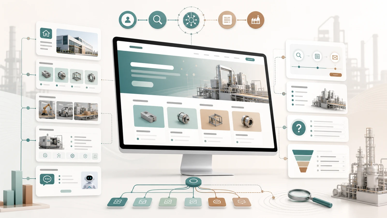
The homepage should support quick orientation
The first job of a manufacturing homepage is to help first-time visitors decide whether they have found the right company. Buyers usually look for products, applications, service scope and a contact path before they study company culture.
If the homepage starts only with generic words such as professional, honest, innovative or leading, buyers still do not know what the company actually provides or which page to visit next. The homepage should organize complex information into a clear browsing path.
The first screen should clarify product and buyer fit
The first screen can use one clear statement to explain the main business, core product category or target buyer. For export and industrial companies, the message should be specific enough to show product type, application or buyer scenario instead of only a vision slogan.
The first screen does not need to force every keyword into one place or show every product. It should help the buyer make an initial judgment and move toward product categories, application pages or an inquiry action.
- Does it name a clear product or service category?
- Does it show the relevant industry, material or buyer type?
- Does it avoid unverifiable claims such as first, leading or guaranteed?
- Can mobile visitors understand the main direction quickly?
Connect products with applications
A manufacturing homepage should not be only a product list. A stronger structure connects core products, application scenarios and buyer questions so visitors can see which products may fit their process or purchasing task.
Product categories answer what the company provides. Application sections explain where those products are used. Technical capability explains why the company can support the work. A content hub answers common buyer questions. Together, these entries build the site’s understanding path.
Use proof that can be verified
The homepage can show factory visuals, product details, inspection workflows, certification categories, technical document entries and service processes. The goal is to help buyers judge real capability, not to fill the page with unverifiable numbers or client marks.
Client logos without permission, unverified project results and exaggerated rankings should not be placed on the homepage. For long-term SEO and AI search understanding, clear, stable and crawlable information matters more.
Review the homepage with a checklist
After planning the homepage, review it from the buyer’s path. Can the buyer understand who the company is, what it provides, where it fits, why it is credible and how to take the next step?
- Does the first screen explain the main business direction?
- Do product categories match the real business scope?
- Do application sections connect to relevant product pages?
- Are technical capability and service process entries visible?
- Can the content or insight area be updated over time?
- Does the inquiry button lead to a specific next action?
- Do Chinese and English pages keep the same facts and boundaries?